Colourful vs Chaotic: What Actually Makes a Bouquet Work
The Colour Theory Behind a Bouquet That Has No Business Working
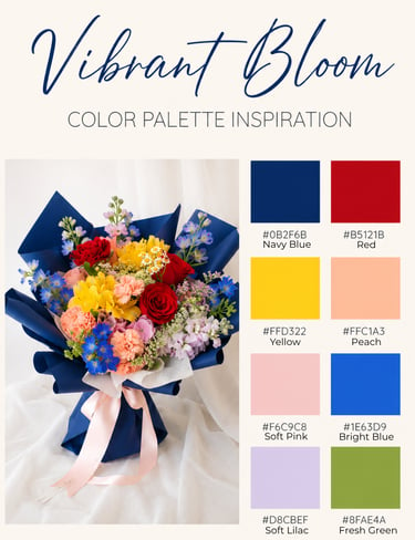
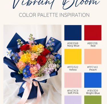
What makes this bouquet work:
1. One strong anchor colour grounds everything
That navy wrap is doing a LOT of heavy lifting.
Without it, this could easily become pasar malam chaos.
Navy acts like a visual neutral, similar to black, but softer and richer. It gives all the bright florals a structured backdrop so they read as intentional rather than random,
2. Repetition creates order
You’re not actually using 20 unrelated colours.
You’ve got clusters:
Blue: delphinium / tweedia-ish tones + navy wrap
Warm pink/peach: carnations, roses, stock
Red: repeated roses/carnations
Yellow: repeated focal blooms
When colours repeat, the eye sees rhythm instead of clutter.
If every bloom were a unique one-off colour, this would collapse.
3. Clear warm vs cool balance
This is the big one.
Warm: red, peach, yellow, cream
Cool: blue, lilac, navy
Too many warms alone = loud / childish / supermarket bouquet vibes
Too many cools alone = flat / icy / detached
This has tension. That makes it interesting.
4. Saturation is mostly consistently high
The colours are all similarly vivid which is super important.
What usually kills colourful bouquets is mixing:
one muddy muted mauve
one neon orange
one dusty sage
one screaming hot pink
Different saturation families fight.
Here, most colours are confidently bright, so they feel like they belong in the same visual language.
5. White/air pockets give the eye somewhere to rest
The Queen Anne’s lace / lighter filler / pale stock create breathing room.
Without those pauses, it becomes visual shouting.
Think of it like punctuation.
6. Shape discipline
The bouquet form is controlled.
Even though the colours are playful, the arrangement itself isn’t messy:
rounded central mass
intentional flower placement
defined silhouette
structured wrap
A wild colour palette can work if the structure is disciplined.
7. The navy + blush ribbon combo softens the whole thing
If this were wrapped in bright yellow or red?
Absolute disaster.
Navy = sophistication
Blush ribbon = softness
That pairing makes the rainbow florals feel premium rather than kiddy.
Why it feels good emotionally:
It reads as joyful but expensive.
A lot of colourful bouquets skew:
graduation bouquet
get well soon
supermarket mixed bunch
This avoids that because the styling says luxury, while the florals say happiness.
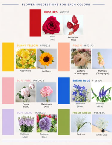
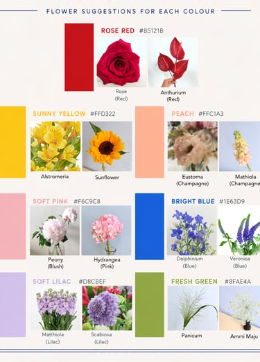
And here are some floral suggestions should you wish to create your own bouquet with this colour theme!